Thank you for purchasing my theme. If you have any questions that are beyond the scope of this help file, please feel free to email me at cesiel1993@gmail.com. Thanks so much!
HTML
Pristine comes packaged with 11 (12 including this file) HTML files (listed below) for different aspects of a website. It also has a plentitude of easy-to-use options using HTML.
- index.html: Home Page - Nivo Slider Display
- index-roundabout.html: Home Page - Roundabout Display
- index-accordion.html: Home Page - Accordion Display
- about.html: About Page
- portfolio.html: Default 3-Column Portfolio Page
- portfolio2.html: Two-Column Portfolio Page
- portfolio3.html: Uneven Two-Column Portfolio Page
- portfolio4.html: Mix Columns Portfolio Page
- portfolioitem.html: Page for a Portfolio Item
- blog.html: Blog Page
- contact.html: Contact Page
Navigation
On every page, the navigation appears within the blue header in top right portion of the page. The menu is a dropdown, so, you will notice that, on hover, more links slide down from links that have the arrows next to them. Editing the navigation is easy. It is just one big list, so, if you want to add a top level link, just add it to the first list. If you want to add a dropdown, just add a list within a list item (a UL within a LI).
Reference: http://dynamicdrive.com/dynamicindex1/ddsmoothmenu.htm
Displays
For the homepage, you have the option between three different displays - Nivo Slider (Fancy Transitions), Roundabout, and Accordion.
Nivo Slider (Fancy Transitions)
The Nivo Slider is the default display for the homepage. It creates a nice showcase for images with its fancy transitions. The HTML for the Nivo Slider is very is to use and implement. Below is the default code in this theme, simply modify the image location, alt and title (the title is the description!). Images should be 880px x 380px to fit properly.
<img src="IMAGE LOCATION" alt="ALT DESCRIPTION" title="TYPE DESCRIPTION HERE" />
<img src="IMAGE LOCATION" alt="ALT DESCRIPTION" title="TYPE DESCRIPTION HERE" />
<img src="IMAGE LOCATION" alt="ALT DESCRIPTION" title="TYPE DESCRIPTION HERE" />
</div>
Reference: http://nivo.dev7studios.com/
Roundabout Display
The Roundabout Display rotates in a circular motion on click between different images. When you click on an image, an overlay in the lower right hand corner appears and you can click to view the portfolio item page. Images should be 580px x 300px to fit properly.
Then, further down, you will find code that looks like the code below. Editing should be fairly self-explanatory. Just take a look at the Roundabout Display and you should be able to figure out what is what. If you have any problems, feel free to contact me.
<div id="display">
   <ul>
      <li>
         <a href="portfolioitem.html" title="Portfolio Item">
         <img src="images/580x300-white.jpg" alt="Pristine - View Project" />
         <span>View Project</span>
         </a>
      </li>
      <li>
         <a href="portfolioitem.html" title="Portfolio Item">
         <img src="images/580x300-black.jpg" alt="Pristine - View Project" />
         <span>View Project</span>
         </a>
      </li>
   </ul>
</div>
Reference: http://fredhq.com/projects/roundabout/
Kwicks (Accordion) Display
The horizontal accordion is a nice display that slides between images as you hover over them. The display also has an overlay on each of the image as an area to add a description.
Below is an example of one image in the accordion. Currently, Pristine is setup for six, so you would need to add five more of these LIs to make the accordion fit properly in the header.
<div id="display" class="haccordion">
   <ul>
      <li>
         <div class="kwicks_overlay">
            <img src="IMAGE LOCATION" alt="ALT DESCRIPTION" />
            <div class="kwicks_description">
               <div class="description_content">
                  <h3 class="slimtopmargin">TITLE OF DESCRIPTION GOES HERE</h3>
                  DESCRIPTION GOES HERE
               </div>
            </div>
         </div>
      </li>
   </ul>
</div>
Reference: http://www.jeremymartin.name/projects.php?project=kwicks
Columns
If you look at the different portfolio options, you will notice the different column options available with Pristine. There is two columns uneven, even two columns and three columns.
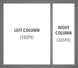
Two Columns (Uneven)
For the larger left column, use the following code
Below, that should be followed by the slimmer right column
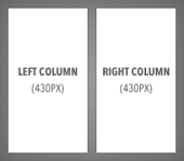
Two Columns (Even)
Similarly to the two columns uneven setup, even two columns has two sections. For the left side, use the following code.
Then, the right side would be the following code.
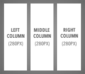
Three Columns
Setting up three even columns is the same as setting up two even columns except there are three items. To create three columns, use the following code.
<div class="threecols_2">MIDDLE COLUMN CONTENT</div>
<div class="threecols_3">RIGHT COLUMN CONTENT</div>
Multiple Column Styles on the Same Page
If you look at Portfolio 4 you will notice both the three column and two columns (uneven) styles on the same page. You can do this with anything by including <div class="spacer"></div> between the end of one column type and the start of another.
Quotes
Pristine contains formatting for two different types of quotes - a pull quote and blockquote.
Pull-out Quotes
Pull-out quotes can be used to pull-out and emphasize important quotes or information in a paragraph or body of text.
Left Pull-out Quote: <div class="pullout-left">QUOTE</div>
"Aliquam eget nibh nulla, in cursus magna. Integer id iaculis dui."
Aliquam eget nibh nulla, in cursus magna. Integer id iaculis dui. Nulla accumsan facilisis turpis, vitae sagittis dolor fringilla ut. Pellentesque quam diam, luctus ac ultrices in, adipiscing vitae sapien. Donec fringilla porttitor porta. Nullam ut nunc enim. Cum sociis natoque penatibus et magnis dis parturient montes, nascetur ridiculus mus. Ut dapibus euismod gravida. Phasellus feugiat mi id tortor placerat laoreet. Phasellus pellentesque, leo ac consequat imperdiet, turpis lectus mollis massa, non cursus metus magna quis lacus.
Right Pull-out Quote: <div class="pullout-right">QUOTE</div>
"Aliquam eget nibh nulla, in cursus magna. Integer id iaculis dui."
Donec gravida tempor odio, id interdum neque dignissim eget. Ut vel massa eget massa elementum fringilla. Aliquam erat volutpat. Ut in risus odio. Praesent vestibulum odio ut lectus euismod adipiscing. Vivamus commodo tincidunt consectetur. Proin nec nulla at urna adipiscing convallis. Proin egestas nibh non augue malesuada mattis. Nunc sit amet metus leo. Nulla facilisi. Quisque facilisis enim ac augue pharetra feugiat. Maecenas ante arcu, commodo ut ultricies sit amet, egestas ut erat.
Blockquote
A block quote is very simple and easy to create. Simply surround the text with the tag blockquote, like so: <blockquote>Quote Here!</blockquote>
Filetypes
Using the Silk icon set, Pristine also contains formatting for displaying file type icons next to text.
PDF File Here - <div class="file_pdf">TEXT NEXT TO ICON GOES HERE</div>
PHP File Here - <div class="file_php">TEXT NEXT TO ICON GOES HERE</div>
HTML File Here - <div class="file_html">TEXT NEXT TO ICON GOES HERE</div>
CSS File Here - <div class="file_css">TEXT NEXT TO ICON GOES HERE</div>
Word File Here - <div class="file_word">TEXT NEXT TO ICON GOES HERE</div>
Powerpoint File Here - <div class="file_ppt">TEXT NEXT TO ICON GOES HERE</div>
Excel File Here - <div class="file_excel">TEXT NEXT TO ICON GOES HERE</div>
Flash File Here - <div class="file_flash">TEXT NEXT TO ICON GOES HERE</div>
Video File Here - <div class="file_video">TEXT NEXT TO ICON GOES HERE</div>
Download this file - <div class="file_download">TEXT NEXT TO ICON GOES HERE</div>
Reference: http://www.famfamfam.com/lab/icons/silk/
Tables
Pristine consists of some basic formatting for tables that may be useful for styling tabular information.
| Table Header 1 | Important Column | Table Header 3 | Table Header 4 |
|---|---|---|---|
| Table Cell 1.1 | Table Cell 2.1 | Table Cell 3.1 | Table Cell 4.1 |
| Table Cell 1.1 | Table Cell 2.1 | Table Cell 3.1 | Table Cell 4.1 |
| Table Cell 1.1 | Table Cell 2.1 | Table Cell 3.1 | Table Cell 4.1 |
All formatting is done to the default tags (table, tr, th, and td) except for the important column background color change. For that, all you have to do is assign the class, important_column, to any of the table tags.
Lists
Pristine contains styling for much more beyond the typical unordered list.
No Bullets
- List Item 1
- List Item 2
- List Item 3
Simple Bullets
- List Item 1
- List Item 2
- List Item 3
Check List
- List Item 1
- List Item 2
- List Item 3
Green Arrows List
- List Item 1
- List Item 2
- List Item 3
Small Black Triangles List
- List Item 1
- List Item 2
- List Item 3
Messages
Pristine has styling for error, warning, and successful messages. All three have an icon from WeFunction's free icon set.
Successful
 Successful Message
Error
 Error Message
Warning
 Warning Message
Reference: http://wefunction.com/2008/07/function-free-icon-set/
Buttons
For certain special links, you have the ability to format them as buttons.
Smaller Button
Bigger Button
CSS
Pristine includes six CSS files for all of its styling. Below are file explanations and instructions on how you can change the color of the theme with a couple small CSS modifications.
- style.css: Master Stylesheet
- style.css: Internet Explorer Fixes
- ddsmoothmenu.css: Navigation Menu Styling
- prettyPhoto.css: prettyPhoto Plugin Styling
- kwicks.css: Kwicks Display Styling
- nivo-slider.css: Nivo Slider Display Styling
- roundabout.css: Roundabout Display Styling
Changing Theme Colors
There are six different color variations including the default blue theme. They are red, green, teal, gray and purple. Changing to a different color scheme only involves changing a couple lines within style.css. Follow the instructions below:
Teal
- Change link colors to #478681
- For #header, #nivoslider, #roundaboutdisplay, and #accordiondisplay change the blue in ../images/blue/display_accordionroundabout.jpg to teal
- Change a:hover .button background image to tealbutton_hover.png
Gray
- Change link colors to #999999
- For #header, #nivoslider, #roundaboutdisplay, and #accordiondisplay change the blue in ../images/blue/display_accordionroundabout.jpg to gray
- Change a:hover .button background image to graybutton_hover.png
Red
- Change link colors to #a45240
- For #header, #nivoslider, #roundaboutdisplay, and #accordiondisplay change the blue in ../images/blue/display_accordionroundabout.jpg to red
- Change a:hover .button background image to redbutton_hover.png
Orange
- Change link colors to #a45240
- For #header, #nivoslider, #roundaboutdisplay, and #accordiondisplay change the blue in ../images/blue/display_accordionroundabout.jpg to orange
- Change a:hover .button background image to redbutton_hover.png
Green
- Change link colors to #517132
- For #header, #nivoslider, #roundaboutdisplay, and #accordiondisplay change the blue in ../images/blue/display_accordionroundabout.jpg to green
- Change a:hover .button background image to greenbutton_hover.png
Purple
- Change link colors to #5c5783
- For #header, #nivoslider, #roundaboutdisplay, and #accordiondisplay change the blue in ../images/blue/display_accordionroundabout.jpg to purple
- Change a:hover .button background image to purplebutton_hover.png
Photoshop Files
One Photoshop file comes with Pristine. The design was created with the latest Adobe software, Adobe Photoshop CS4 and CS5. Below are several pointers on how to edit and use the file.
- home.psd: Master Photoshop File
Changing the Title
The best way to change the title (default is Pristine with tagline) is with Photoshop. Open up the headerbg.jpg of your choice (ex: teal_headerbg.jpg) and type your own title or add your own logo (approximately 40px padding).
Showing Different Color Schemes
All six of Pristine's color schemes are included in home.psd. To show the different colors, open the folders "Header" and "Call to Action". Then, under "Header" open "Header BGs" and under "Call to Action", open "Button Hover BGs." Now, show a different color by clicking in the blank square next to the folder name to make an eye appear.
PHP
There is one PHP file that comes with Pristine that sends the information from the contact form to an email. The only editing you need to do in this file is edit it so it sends to the correct email.
- send.php: Contact Form Send File
Changing the Target Email Address
Open send.php and find $to = "YOUREMAIL@YOUREMAIL.COM"; and change YOUREMAIL@YOUREMAIL.com to your email. Then, save the file and your contact form will be functional. Keep in mind that for the PHP to work, the site must be uploaded to a webserver with PHP capabilities, you cannot run it locally on your computer.
Javascript
Pristine uses a variety of open source/free plugins for the jQuery Library to enhance its expierence and user interface. There are a total of nine javascript files that create various animation effects within Pristine and another, the jQuery Library, that is included externally from Google. Below are brief descriptions on how you can edit different effects to your needs. Please keep that basic editing is fairly self-explanatory. If you're having trouble or want to learn more, visit the reference links.
- jquery.nivo.slider.pack.js: Nivo Slider
- custom.js: Portfolio Fading Hover Effects
- ddsmoothmenu.js: Navigation menu Effects
- DD_belatedPNG_0.0.8a-min.js: Internet Explorer PNG Fix
- kwicks.js: Kwicks Display
- jquery.easing.1.3.js: Easing for Accordion
- jquery.roundabout-1.0.min.js: Roundabout Display
- jquery.roundabout-shapes-1.1.js: Roundabout Display
- jquery.prettyPhoto.js: prettyPhoto Image Popup Plugin
- jquery.form.js: jQuery Form Handler
Nivo Slider (Fancy Transitions)
Nivo Slider has many different effects and easy to use and modify. Take a look at the code below to see how you can change it to suit your needs
$(window).load(function() {
	$('#display').nivoSlider({
		effect:'random',
		slices:10,
		animSpeed:500,
		pauseTime:3000,
		directionNav:false, //Next and Prev
		directionNavHide:true, //Only show on hover
		controlNav:true, //1,2,3...
		pauseOnHover:true, //Stop animation while hovering
		manualAdvance:false, //Force manual transitions
		beforeChange: function(){},
		afterChange: function(){}
	});
});
Reference: http://nivo.dev7studios.com/
Roundabout Display
The default roundabout display settings in Pristine are the optimal settings. However, view all the options and see what you can change at the plugin's homepage under the options section.
Reference: http://fredhq.com/projects/roundabout/
Kwicks Display
Similarly to the Roudabout Display, the Kwicks Display is already setup with optimal settings. You can go to the plugin's homepage to learn more. If you would like to add more items or take off some, you will need to play with the widths to get them to fit correctly.
Reference: http://www.jeremymartin.name/projects.php?project=kwicks
prettyPhoto Plugin Options
prettyPhoto is one of the most powerful, slick popup plugins for jQuery. It has many options and is very easy to change. For the complete list of options, head on over to the Documentation page. If you're looking for all the different ways you can use prettyPhoto, go to the homepage and check out the demos.
Reference: http://www.no-margin-for-errors.com/projects/prettyphoto-jquery-lightbox-clone/